

Get More Insights with Google Analytics Data Views
Get More Insights with Google Analytics Data Views
How to make the best out of Google Analytics 5 different data views

How to make the best out of Google Analytics 5 different data views
When using Google Analytics reports, most users look at the standard table data view. However, Google Analytics has five different data views (located next to the advanced filter).

Data View: This is the view by default, allowing you to see the results in columns
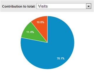
Percentage View: This more visual view adds a column and a pie chart showing the percentage of total that each category represents. This is not useful if your table had a lot of lines.
In the example below, we apply the pie chart option to make it clear how important it is to use a responsive website.
Audience -> Mobile -> Overview
Performance View: This view is similar to the percentage view but in a bar chart.
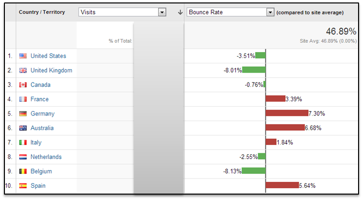
Comparison View: give context to your data with site average as a baseline.
For example, looking at the Location report, we see where most visits come from. Switching to Comparison View and applying the bounce rate metric, reveals the following: visits from Belgium are much lower than those from Germany, but the performance is better, because the bounce rate is lower and visits originating from Belgium viewed multiple pages.

Pivot table view: This allows you to view your data in a multi-dimensional table. This can show you more advanced details on your data, comparing sets of data that are not obvious.
This blog post gives a few great examples of Google Analytics pivot tables.